MGExplorer
Multidimensional Graph Explorer
In an exploratory context, users often have no specific goal in mind and aren't seeking a particular outcome. However, when they discover something intriguing, it's important for them to retrace their steps and understand how they arrived at those results. Additionally, validating hypotheses may require branching out to compare data across different views.
MGExplorer is designed to facilitate data exploration with a flexible visualization approach. Utilizing the concept of chained views, MGExplorer allows users to visualize their analytical journey through a sequence of views. This feature supports various visualization techniques across multiple datasets, enabling users to explore different scenarios, retrace their steps, and refine their analysis as needed.
The chained views methodology in MGExplorer lets users seamlessly integrate multiple visualization techniques during their exploration process. It records every step of the journey, providing a detailed map of the analytical path. This not only enhances understanding but also supports comprehensive analytical provenance studies.
With MGExplorer, you can unlock the full potential of your data, uncover hidden insights, and navigate your exploratory path with ease.
Visualization Techniques
Node-link diagram
The node-link diagram represents nodes as items and the edges between them as relationships, offering a clear overview of any network in the dataset based on criteria such as keywords or co-publications. It is the primary technique used by the application, serving as the foundation for all other visualization techniques.
Users can interact with the diagram by hovering over nodes to highlight them and by right-clicking a node to generate a new visualization based on its data. For example, if nodes represent authors and edges indicate co-authored works, selecting a node will filter the data to focus on that author. The diagram also includes filters to help locate specific nodes in large networks and allows users to adjust settings like distance, gravity, and repulsion to refine the network view.

Cluster View
The Cluster View technique visualizes clusters based on relationships among data items. It features a multi-ring layout: the innermost ring displays the data items as circles, while the outer rings represent various data attributes using rectangles. Items within the same cluster are connected by curved lines.
By default, it displays four rings, but this can be adjusted to fit the number of data attributes and rings needed. Users can interact with the view by hovering over the connecting lines to highlight different clusters, making it easy to explore and understand the relationships within the dataset.
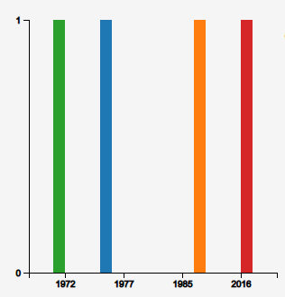
Distribution View
The Bar Chart technique visualizes the distribution of data attributes' values over time or across categories. By default, the x-axis represents temporal information, while the y-axis shows the count of associated items per time period.
The data is presented as either a single bar for each time period or multiple colored bars to represent different categories or attributes. This approach allows for a clear comparison of attribute values across different time periods or categories, making trends and patterns easy to identify.
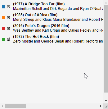
Listing View
The Listing View technique presents a detailed list of elements that define the relationships between two or more nodes in a graph. Each item in the list is linked to a descriptive web page within the dataset, allowing users to access additional information about each element. This view facilitates a deeper exploration of the relationships by providing direct access to further details about each listed item.
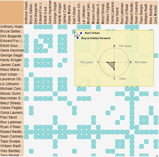
Pairwise Relationship View
The Pairwise Relationship View technique visualizes clusters using a matrix where both rows and columns represent data items. Each cell in the matrix contains a glyph that encodes attributes describing the pairwise relationships between the items.
The default glyph resembles a star plot, with multiple axes extending from a central point. Each axis represents a different data attribute and is used to encode its corresponding value.
Hovering over a glyph enlarges it, allowing users to view detailed information about the data attributes. This interaction facilitates a deeper understanding and analysis of the relationships within the cluster.
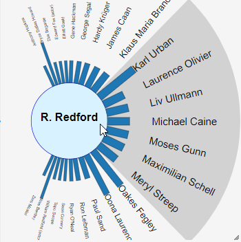
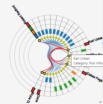
Egocentric View
The technique isolates a data item of interest at the center of a circular view, displaying the remaining related data items around it. Inspired by the eye's iris, which focuses on a limited field of view, this visualization technique places the selected item at the center and arranges its related items in a way that those within the central field of view appear larger than those further out.
Data attributes for these relationships are represented by bars connecting the central item to each related item, with the height and color of these bars encoding different attributes. Users can shift the focus by clicking on any item, moving it to the center and updating the view to highlight new relationships.
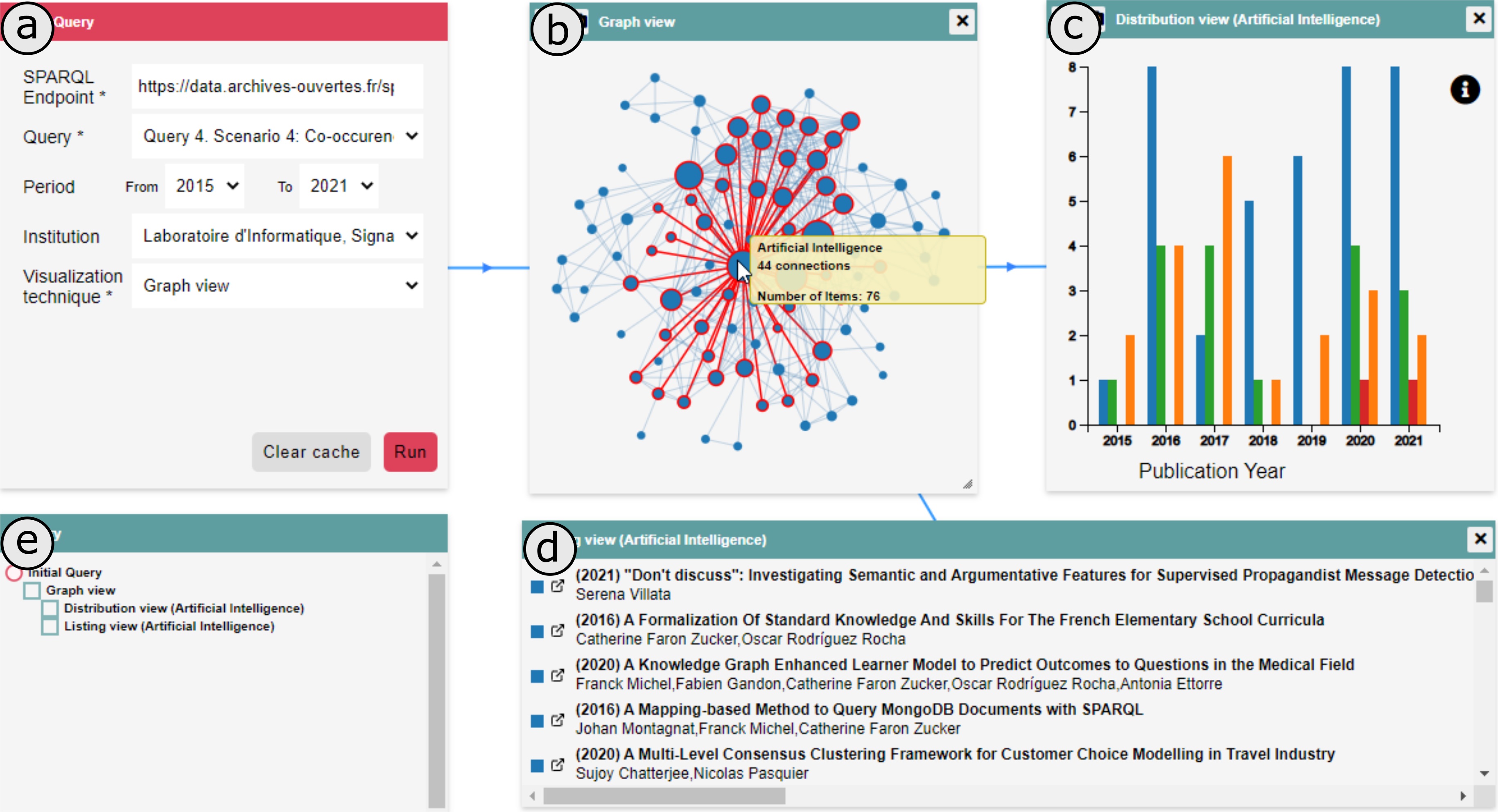
Data Import through SPARQL queries
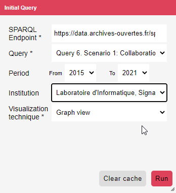
The visualization tool includes a querying process that enables users to retrieve datasets from multiple SPARQL endpoints and explore them within a single dashboard. This is managed through a query panel, which lists available SPARQL endpoints and supported queries. Queries are created and managed through the LDViz interface
When a query is selected, the panel displays custom parameters to filter the data based on criteria like publication period or research institution. Users can then choose a visualization technique and click "Run" to retrieve data, apply the query, transform the data, and generate the selected visualization. The tool uses a cache to store query results temporarily, which helps reduce the frequency of data server access. Users can clear the cache to ensure that the next query retrieves updated data from the server.
Types of Queries
- Initial Query: This starts the exploration process by allowing users to define the initial SPARQL endpoint and query. It requires predefined queries and at least one query that does not need input values, such as retrieving a co-authorship network based on an author's name.
- Follow-Up Query: This query integrates new data into the exploration by applying a new query to the current or a different SPARQL endpoint. It requires at least one visualization on the dashboard and a selected item from that visualization as input for the new query.
- Cloned Query: This allows users to create a copy of an existing query panel, including its input data and parameters. The copied panel can be modified to generate a new visualization with different data. It requires at least one follow-up query to be present on the dashboard.
Query Panel
The query panel provides an interface for selecting SPARQL endpoints and queries. It includes:
- A list of available SPARQL endpoints.
- Supported queries for each endpoint.
- Custom parameters to filter the data (e.g., publication period, research institution).
Related Publications
- Aline Menin, Pierre Maillot, Catherine Faron, Olivier Corby, Carla Maria Dal Sasso Freitas, et al.. LDViz: a tool to assist the multidimensional exploration of SPARQL endpoints. Web Information Systems and Technologies : 16th International Conference, WEBIST 2020, November 3-5, 2020, and 17th International Conference, WEBIST 2021, October 26–28, 2021, Virtual Events, Revised Selected Papers, LNBIP - 469, Springer, pp.149-173, 2023, LNBIP - Lecture Notes in Business Information Processing, 978-3-031-24196-3. ⟨10.1007/978-3-031-24197-0⟩. (hal-03929913)
- Aline Menin, Minh Nhat Do, Carla Dal Sasso Freitas, Olivier Corby, Catherine Faron Zucker, et al.. Using Chained Views and Follow-up Queries to Assist the Visual Exploration of the Web of Big Linked Data. International Journal of Human-Computer Interaction, 2022. (hal-03518845)
- Aline Menin, Catherine Faron Zucker, Olivier Corby, Carla Dal Sasso Freitas, Fabien Gandon, et al.. From Linked Data Querying to Visual Search: Towards a Visualization Pipeline for LOD Exploration. International Conference on Web Information Systems and Technologies (WEBIST), Oct 2021, Online Streaming, France. (10.5220/0010654600003058). (hal-03404572)
- Aline Menin, Ricardo Cava, Carla Dal Sasso Freitas, Olivier Corby, Marco Winckler. Towards a Visual Approach for Representing Analytical Provenance in Exploration Processes. IV 2021 - 25th International Conference Information Visualisation, Jul 2021, Melbourne / Virtual, Australia. (10.1109/IV53921.2021.00014). (hal-03292172)
- Maroua Tikat, Aline Menin, Michel Buffa, Marco Winckler. Engineering Annotations to Support Analytical Provenance in Visual Exploration Processes. ICWE 2022 - 22nd International Conference of Web Engineering, Jul 2022, Bari, Italy. pp.1-16, (10.1007/978-3-031-09917-5_14). (hal-03779349)
- Anne Toulet, Franck Michel, Anna Bobasheva, Aline Menin, Sébastien Dupré, et al.. ISSA: Generic Pipeline, Knowledge Model and Visualization tools to Help Scientists Search and Make Sense of a Scientific Archive. ISWC 2022 - 21st International Semantic Web Conference, Oct 2022, Hangzhou, China. (10.1007/978-3-031-19433-7_38). (hal-03807744)
Contact
- Aline Menin, Associate Professor at Université Côte d'Azur (E-mail: aline.menin@inria.fr)
- Marco Winckler, Full Professor at Université Cote d'Azur (E-mail: marco.winckler@inria.fr)
*This work is developed by the Wimmics team at the Centre Inria, University Côte d'Azur. It results from collaborative efforts involving several researchers and students.